A while back on the Geographic Information Systems Subreddit I stumbled upon this question. A user wished to get height information from this elevation map they had found somewhere:

Unforunately it has hill-shading applied on top of the color bar. While this shading technique makes it easier to understand the terrain structure at a glance, it also makes it harder to extract the raw height data from the map. So first we’ll have to understand how hill-shading works in order to find a way to get around it.
Hill-shading
The point of hill-shading is make a height map appear 3D by shading slopes according to imaginary sunlight that hits the plane at some angle.

When creating a regular elevation map, one takes the raw elevation values and maps them to $(r, g, b)$ values according to a specified color scale. To achieve hill-shading, one additionally specifies a global light vector $\vec l$ and a surface normal vector $\vec n$ for each point. The shading factor can then be expressed as the scalar product $s = \langle -\vec l, \vec n\rangle$.
The important point here is that the shading factor is applied uniformly to all three color channels. This means that hillshading only affects the brightness of a pixel, but not its hue. So if the color scale plays nicely with the hue, we will be able to extract the original height data.
Getting our hands dirty
Time to whip out python and get going! Reading the image is pretty straight forward.
import numpy as np
import matplotlib.pyplot as plt
import colorsys

img = plt.imread('hillshade_rotated.png')
We then take a look at the image and find a line that slices through the color bar. From this bar we’ll deduce the transform needed to convert hue to elevation
plt.figure(figsize = (10, 10))
plt.grid(False)
plt.imshow(img)
plt.plot([97, 97], [95, 755]);

We can now take the data from the color bar. To be sure, we plot the color bar data to verify that we actually extracted what we wanted.
colorbar = img[755:95:-1, 97:98, :]
plt.grid(False)
plt.imshow(np.kron(colorbar, np.ones((1, 60, 1))).transpose(1, 0, 2));
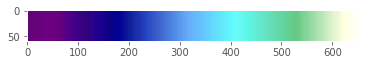
The extracted color bar
Upon extracting the hue channel from the color bar data, we see that it is in fact monotonic and close to injective! This means we can reconstruct the original elevation data from just this channel.
def convert(image):
    fun = np.vectorize(colorsys.rgb_to_hsv)
    return np.stack(fun(image[:,:,0], image[:,:,1], image[:,:,2]))
HUE, SATURATION, VALUE = convert(colorbar)

HIGH = -40
LOW = -78.08
def correct(x):
    H = np.sort(HUE.reshape(-1))
    return HIGH - (HIGH - LOW) * H.searchsorted(x) / len(H)

fig, (ax1, ax2) = plt.subplots(1, 2, figsize=(10, 5))
ax1.plot(HUE)
ax1.set_title('Hue Progression')
ax2.plot(correct(HUE))
ax2.set_title('Corrected Elevation Progression')

The left plot shows how the hue progresses over the color bar.
The right plot shows how the color bar looks when corrected using np.searchsorted:
Now, we can calculate the hue channel for the entire image and reconstruct the elevation values using the correction function we just wrote.
h, s, v = convert(img)
corrected = correct(h)

plt.figure(figsize=(10, 10))
plt.grid(False)
plt.imshow(corrected, cmap='gray')
plt.imsave('elevation_rotated.png', corrected , cmap='gray')

As a quick check, we’ll plot the output:
There’s a lot of ugly artifacts going on! Why is that? As you may have guessed, JPEG compression is to blame here. Pixels close to the border of the heightmap that should be white get assigned some color that slightly differs from white. Because we only look at the hue channel, this is enough to distort these pixels completely.
This is where the saturation channel comes in handy. These almost-white pixels have close to no saturation, so it is enough to cut off the pixels at some saturation value
corrected[s < 0.1] = None

plt.figure(figsize=(10, 10))
plt.grid(False)
plt.imshow(corrected, cmap='gray')
plt.imsave('elevation.png', corrected , cmap='gray')

This looks much better!
And because stuff is always more fun in 3D, we will end this post with a quick interactive surface plot of the extracted data in plotly:
import plotly.graph_objs as go
from plotly.offline import plot, init_notebook_mode

init_notebook_mode()

Z = corrected[:, 240:610]
Z[Z==1] = 0
surf = go.Surface(z=Z)

layout = go.Layout(
    title='Heightmap',
    autosize=True,
    width=640,
    height=640,
)
fig = go.Figure(data=[surf], layout=layout)
plot(fig, filename='hillshade_elevation')
Find the Jupyter Notebook containing all the source code from this post here.